Watercolor Tattoo Style
What defines the watercolor tattoo style?
The watercolor tattoo style recreates qualities associated with paint on paper: transparent-looking washes, soft blooms, layered color, brush marks, splatters, and edges that appear to dissolve. The tattoo may feel spontaneous, but the effect is carefully planned. Pigment does not actually flow through skin like wet paint, so the artist uses controlled saturation, dot patterns, whip shading, and overlapping hues to create that illusion.
Some watercolor tattoos have a clear black structure beneath the color. Others rely on value changes and stronger color areas to define the subject. Both approaches can work when the focal image remains readable. The defining quality is expressive color movement, not simply placing random splashes behind an outline.
From painted media to tattoo language
Watercolor tattooing takes visual cues from traditional watercolor, ink wash, abstract painting, and contemporary illustration. Artists study the way diluted pigment gathers at an edge, how one color bleeds visually into another, and how untouched paper becomes a highlight. They then translate those observations with tattoo equipment and pigments designed for skin.
The style became highly visible through online portfolios because its bright color and apparent fluidity photograph well. Early examples sometimes prioritized a fresh image over long-term structure. Experienced contemporary artists have refined the approach by combining painterly freedom with stronger value plans, intentional saturation, and spacing that anticipates healing.
Choosing a specialist matters. Look for both fresh and healed examples. Healed work reveals whether pale washes remain visible, whether colors stayed distinct, and whether the subject still reads after the initial brightness settled.
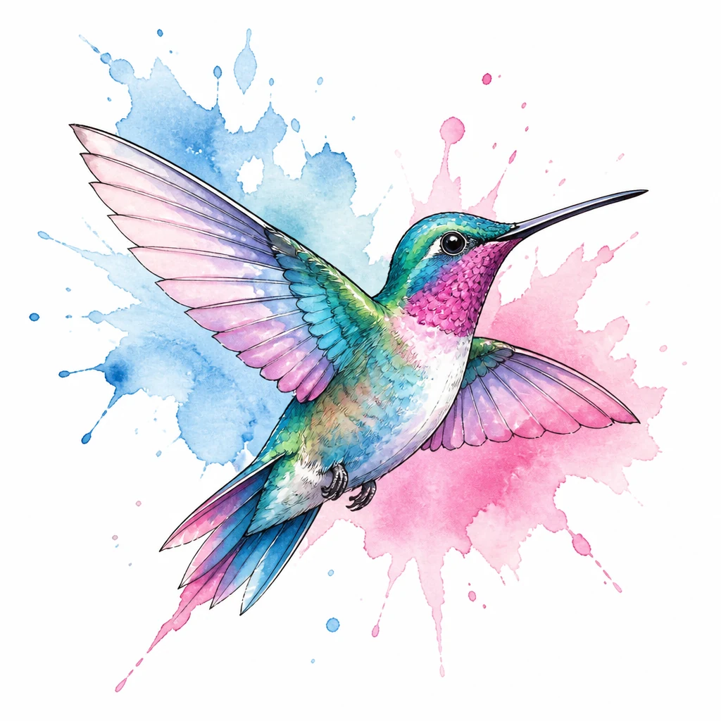
Color blooms, brush marks, and controlled edges
Watercolor effects depend on varied edges. A crisp edge can define the focal subject, while a soft field allows color to fade into skin. Small droplets and dry-brush marks suggest motion, but they should follow the composition rather than surround it evenly.
Layering creates depth. A translucent-looking blue may overlap violet, while a concentrated dark accent anchors the intersection. Artists cannot make tattoo pigment truly transparent in the same way as paint, but they can use skin breaks, lighter saturation, and optical mixing to suggest luminosity.
Value is as important as hue. If every color has the same lightness, the tattoo may lose its focal point. Deep blue, violet, dark green, or selective black can provide structure. Bright yellow and pale pink can then act as highlights instead of carrying the entire silhouette.
Popular watercolor tattoo ideas
Birds, butterflies, fish, foxes, and other animals pair naturally with expressive movement. A hummingbird can trail a diagonal burst of color, while a jellyfish can dissolve into flowing blue and magenta strands. Flowers offer organic petal shapes that support layered washes. Landscapes, planets, constellations, and abstract figures also adapt well.
Music, memory, and travel themes can be represented through color without becoming literal. A simple skyline may dissolve into the palette of a meaningful sunset. A pet portrait can keep the eyes and nose structured while allowing surrounding fur to break into loose pigment-like marks.
The best subjects have a recognizable core. If the color effects were temporarily removed, the main idea should still have a clear silhouette or focal relationship. This prevents the design from reading as an accidental stain from a distance.
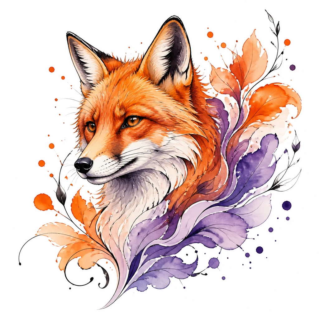
Outline-free versus structured watercolor tattoos
An outline-free design uses color boundaries and value changes to define the image. It can feel especially soft and painterly, but the artist must create enough contrast in the right places. Concentrated edges around an eye, petal center, or wing joint can establish structure without forming a continuous black contour.
A structured watercolor tattoo combines linework with free color. Fine black outlines can preserve delicate botanical forms, while bolder lines can create a graphic contrast between subject and wash. The line does not need to contain every splash; allowing color to extend beyond it creates the painted effect.
The choice should follow the subject and desired longevity. A complex animal portrait may benefit from more structure than an abstract color composition. Discuss how the design is expected to look healed, not only how it appears in a freshly edited portfolio photograph.
Placement, scale, and color longevity
Watercolor tattoos need enough room for color transitions and open skin. The upper arm, forearm, thigh, calf, shoulder blade, and back are versatile placements. Long brush-like movement can follow a limb, while broad blooms suit the shoulder or thigh.
Very small designs limit the number of distinct washes that can remain separate. Simplifying the palette and choosing one strong color gesture is better than compressing a full painted scene. Areas exposed to frequent sun may experience faster visible color change, making sunscreen and protective clothing valuable after healing.
Skin tone influences contrast and color perception. The goal is not to force every reference color onto every person, but to build a palette that works with the wearer. Test spots or examples of healed work on similar skin tones can make expectations more concrete.
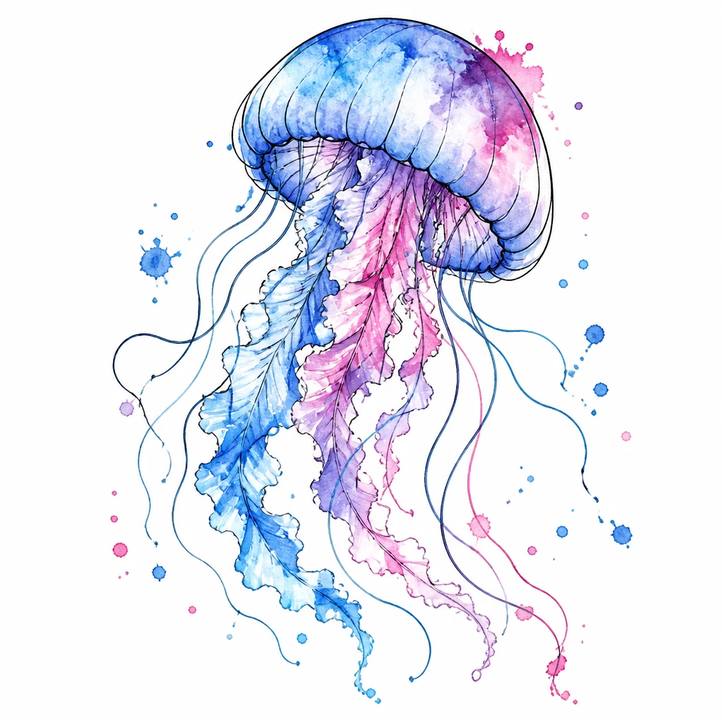
Creating a balanced watercolor concept
Begin with the focal subject, then choose a limited palette and one direction of movement. Describe whether the color should bloom behind the subject, trail from it, or replace part of its form. Specify the mood—energetic, dreamy, calm, or dramatic—because that affects edges and saturation.
In the generator, select Watercolor and try “a jellyfish drifting upward, watercolor tattoo style, translucent blue washes, controlled magenta blooms, a few fine black details around the bell, generous skin breaks, vertical composition.” Avoid asking for every color at once; two or three coordinated hues usually create a more intentional result.
Evaluate the concept in grayscale as well as color. A clear value pattern means the design is less dependent on initial brightness. Then collaborate with a color specialist who can adapt pigment, scale, and placement. A lasting watercolor tattoo style piece combines the freedom of painting with the structural discipline required by tattooing.